Case Study - Avina

Intro Section
The Challenge
A medical client with thirteen locations needed a complete rebrand, including design, a new site, functioning site tools for scheduling, search visibility, and a fresh way to present to clients both digitally and in-person.
The Result
The site was overhauled with new brand and logos, appropriate UX within specific restrictions requested by the client, a new phone system for intake, a social media presence and posting plan, a way to guage client satisfaction, complete ownership of control of Google My Business and other listing directories, new brand voice, new patient brochures and print content, signage, planned events, and other hybrid stratgies were executed.
My Role
I managed the web development project, designed the tool architecture, worked on user forms, created the SEO strategy and managed SEO research, educated clients on SEO, generated reports and taught clients how to read the reporting data, created new and better ways to collect data and customer feedback, collaborated with the client on their social strategy, helped client with initial brand concepts, naming and overall brand voice, assisted marketing team, and built an ecommerce strategy that could be easily incorporated into exisitng brand and technologies held by the client.
UX Function and Copy

For this site, Design worked on logo, colors and a broad sitemap. The client had more control about which pages and sections should be included, and it was the job of Development to advise how the new site would absorb specific pages from the old one, thus redirect. This was an aspect I managed; I wanted to retain the SEO between the two sites, and used the http access to rewrite the appropriate rules.
With copy populating the pages of our new site, I took a closer look at our calls-to-action, forms and navigation elements. The buttons would have familiar language, such as 'Learn More' or 'View All'. They were large and clickable, and in some cases, image boxes with underlined-style buttons would also need to internally link to the corresponding content.
The largest areas of the site that I wanted to focus on were forms, navigation, filters and the main site tool - the Request Appointment section. The backend of this site is built on Wordpress. As a front-end, but occasionally back-end developer, I coded some aspects of this site, but also did most of the integrations with plugins that exposed their markup in the editor. In short, plugins like Contact Form 7 have a hybrid-markup style that I utilized to allow for building a complex form and coding in non-native behaviors. You can see the result here.
Notice the checkmarks in the dropdown, the way the animation of the form moves, the way the form loads a section section after completing the initial dropdowns (which is more native app-like than web application behavior), and notice the form styling and language. With a loose design, I created the look and feel of the form, coded the animation behaviors, and lead my team on the logic for the form's UX. UX behavior and copy is my territory at the agency, and after discussing how the expectations of the user, I finalized the approved concept.
This form is a major component of the site and it's mapped so that there are many opportunities to experience a version of it where applicable. You can request an appointment on the main page, per each doctor (with that doctor being a locked option from their single page), you can request an appointment from the sticky button, and from the main patient landing page. And in the backend, each office of the thirteen locations receive an appropriate email with a patient request for only their doctors. This is due to the client not having a centralized scheduling, and it was a specific request of theirs to keep the request traffic seperated.
Another UX challenge to this site dealt not exlusively in how to best serve the user, but how to deliever the correct experience to a site user from behind stipulations given to us by the client. You will see there are two areas of the site that are missing some common features. First, the providers page, which only allows sorting and, by default, forces a randomized masonry view of providers. Secondly, the locations section of the site, which does not allow a user to search for a location and doesn't distribute a directory of offices. Because the client requested not to have a directory, and requested not to allow a physician search on the site, I worked with my team to come up with the acceptable interfaces. See the results here and here.
Finally, the navigation. I like having as few nav items as we can manage and the result is indeed a clean interface, without clutter. The navigation should reflect the mapping of the site, but I began to see a fundemental problem with how the navigation is used to categorize the site for the user. Notice that 'Patients' seems to be in contrast to 'Providers'. 'Locations' and 'Services' are common interface names that user expectation can anticipate, but I felt like the categories of 'Patients' and 'Providers' felt at odds with each other. Providers is an internal word and I would like to replace it with 'Our Doctors'. Clicking the 'Providers' tab also takes the user to a filter page, which can be a little jarring if they aren't sure why they are on the page.
Off Site Optimization, Measuring and Reporting

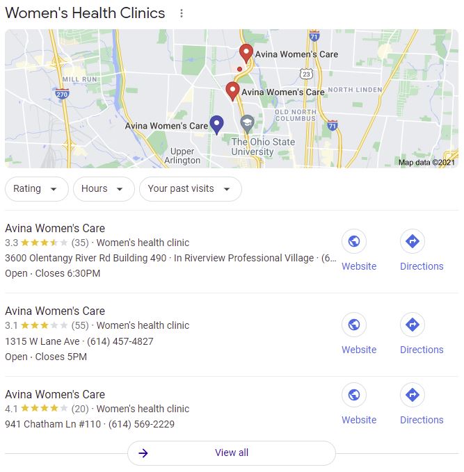
Apart from a functional website and a nicely Brand roadmap, the options to reach consumers falls into the territory of ads or organic SEO. In most cases, I go straight for optimizing on Google My Business as a first order. For our client, they have 13 locataions, all in a congested area, along with 30+ providers. We started by going for the local 3 pack.
Next, the profile of every privder was 100% optimized. Because I manage not just SEO, but brand development as well, this was a great opportunity to showcase our brand voice and use posts to connect with users, as well as find a doctor-to-patient strategy for soliciting reviews.
This business did not pursue paid advertising and decided to put it's efforts into organic, digital marketing and traditional, in-person branding, such as overhauling brochures and packaging, making changes to their physical space, and setting in-office guidelines for staff. Thus our goals to measure success were not just based on clicks and site analytics.
Even though the image provided in Google Data studio is a generic one, I am very serious about providing reports to clients. I use data studio to reflect our tracking set-up with Analytics, Tag Manager and Search Console, and combine those reports with other data such as surveys to help us understand how we can improve the site, the experience, and brand perception.
A Product Strategy

The client already had a product for sale on their website, but the site itself did not accept payments. Patients of this practice could purchase access to the video from their clinic and gain access on the site, via passcode. This system was requested by the client, but in expanding their product-line to supplements, nursing bras, and other physical products, it was time to incorporate a more seamless solution that maintained the brand, fit the client's budget, and allowed them to manage the store without interfacing with their website.
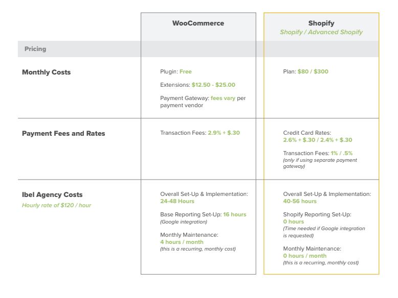
Initially there were two main options for the client: Shopify and WooCommerce. Because the client did not have enough details yet, the best solution would be to create an externally hosted portal on Shopify, design that landing page to still be in line with the brand, write a DNS rule to allow a store.site prefix, and set up our client to manage their own inventory as their situation demanded. While this project is still under development, the planning of it was a highly managed effort that concluded with how our team will revisit the site navigation and incorporate the new shopping platform onto the parent site.